In today’s fiercely competitive commercial market, consumers are exposed to thousands of brand messages every day. How to make one’s own brand stand out among numerous messages, be remembered and recognized by consumers, has become a key question that every enterprise is pondering. Brand VI design, as an indispensable and important part of brand strategy, is precisely the core means for enterprises to solve this problem. It is not just simple logo design or color matching, but a complete and systematic visual language system. It can convey the brand’s core values, concepts and personality to consumers through visual elements, and build an emotional connection between the brand and consumers.
This article will deeply analyze the connotation and constituent elements of brand VI design, as well as the importance, design process, value embodiment and future development trend of the visual identity system in the context of brand strategy. It aims to help enterprises and relevant practitioners gain a comprehensive understanding of brand VI design and better use this tool to promote brand development.
VI, short for Visual Identity, is a crucial component of the Corporate Identity System (CIS). Together with Mind Identity (MI) and Behavior Identity (BI), it forms a complete brand identity system. Simply put, brand VI design is the process of visualizing the abstract spiritual connotations of a brand—such as its philosophy, culture, and values—through specific visual symbols (e.g., logos, fonts, colors, graphics). This creates a unified, standardized, and recognizable visual system, thereby establishing a clear and unique brand image in consumers’ minds.
Unlike pure "art design," brand VI design has clear commercial purposes and strategic orientations. Art design focuses more on personal creativity and artistic expression, pursuing visual aesthetics and uniqueness. In contrast, brand VI design must be carried out around brand strategy: every choice and design of visual elements should serve brand positioning, ensure the accurate transmission of brand information, conform to the aesthetic preferences and cognitive habits of target consumers, and ultimately promote brand awareness, emotional recognition, and purchasing behavior. For example, Apple’s VI design—with its simple Apple logo, sans-serif fonts, and black-and-white-dominated color scheme—not only boasts high visual aesthetics but also conveys the brand’s core values of simplicity, innovation, and high-end quality. Highly aligned with Apple’s brand strategy, it has become one of the most recognizable brand visual images globally.
Brand strategy refers to the overall plan formulated by an enterprise to achieve the long-term development of its brand. It includes core elements such as brand positioning, brand goals, and brand communication strategies. Its core objective is to establish unique brand advantages in the market and enhance brand value and market competitiveness. As a visual implementation tool for brand strategy, VI design has an inseparable inherent connection with brand strategy.
On one hand, brand strategy provides direction and basis for VI design. VI design is not created out of thin air; it must be guided by brand strategy. Brand positioning determines the style and tone of VI design. For instance, brands positioned in the high-end luxury market usually adopt exquisite and elegant visual elements in their VI design, with colors like gold and black that exude a sense of nobility. In contrast, trendy brands targeting young consumer groups tend to have a more lively, personalized, and creative VI design style, with brighter and bolder color combinations. Brand goals also influence the focus of VI design. If a brand’s goal is to expand into the international market, its VI design must consider cultural differences across countries and regions to ensure that visual elements are universal and recognizable globally, avoiding obstacles to brand communication due to cultural taboos.
On the other hand, VI design is an important carrier and support for the implementation of brand strategy. Abstract elements in brand strategy, such as brand positioning and brand philosophy, need to be transformed into perceptible visual information through VI design to be better understood and accepted by consumers. Through unified and standardized VI design, a brand can maintain a consistent visual image across various communication scenarios (e.g., product packaging, advertising, store image, official website). This strengthens consumers’ awareness and memory of the brand, helping the brand quickly establish a unique brand image in the market and achieve its brand strategic goals. For example, Starbucks’ brand strategy is to create a "third place"—a comfortable and relaxing social space between home and the workplace. The visual elements in its VI design, such as the green logo, warm-toned store decoration, comfortable seats, and lighting, all revolve around this strategy. They create a warm and comfortable atmosphere, allowing consumers to perceive the "third place" concept conveyed by the brand when they come into contact with Starbucks’ visual image, thereby recognizing and choosing Starbucks.
Brand VI design is a complex systematic project. It is not a single visual element design but consists of two major parts: basic elements and application elements. Each part includes multiple specific visual symbols, which are interrelated and complementary, jointly forming a complete brand visual identity system.
Basic elements are the core and foundation of brand VI design, serving as the "genetic code" for building the entire visual identity system. They determine the basic characteristics and style of the brand’s visual image, and possess stability and extensibility. The design of all other application elements must be based on the basic elements. The basic elements mainly include the following aspects:
-
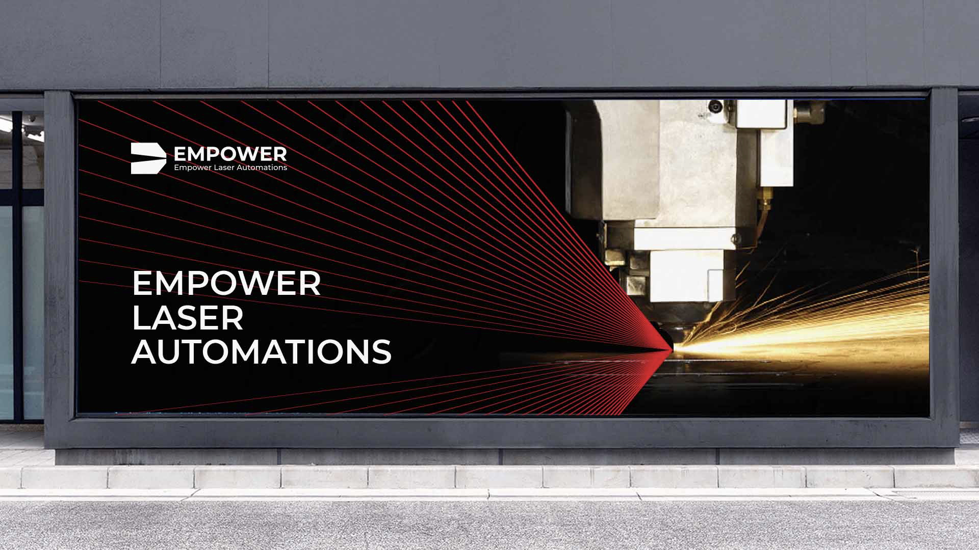
Brand Logo: The brand logo is the core symbol of the brand’s visual image and the most direct and critical element for consumers to identify the brand. It is usually composed of graphics, text, or a combination of both. A successful brand logo needs to be unique, recognizable, simple, and memorable, and should accurately convey the brand’s core values and personality. For example, Nike’s "swoosh" logo uses a simple curved graphic to convey the brand connotations of sports, speed, and strength. It is concise and dynamic, and consumers can immediately recognize it as Nike’s logo even without the brand name. The design of a brand logo must consider application needs in different scenarios (e.g., black-and-white version, color version, reduced version, enlarged version) to ensure that it can be presented clearly and completely in various sizes and materials.
-
Standard Fonts: Standard fonts refer to the unified fonts used by a brand in all visual communications, including fonts for the brand name, headings, and body text. The selection and design of standard fonts must be consistent with the style of the brand logo, conform to the brand’s positioning and personality, and at the same time ensure readability and aesthetics. Different font styles convey different brand temperaments. For example, serif fonts (such as Songti, Times New Roman) give a sense of tradition, elegance, and formality, making them suitable for high-end and classic brands. Sans-serif fonts (such as Heiti, Arial) are characterized by simplicity, modernity, and clarity, making them more suitable for technology, fashion, and young brands. For instance, Microsoft’s standard font is the sans-serif font Segoe UI. Its simple and modern style aligns with Microsoft’s positioning as a technology brand. It is uniformly used in all visual scenarios of Microsoft, including product interfaces, advertising, and official websites, strengthening the brand’s sense of modernity and technology.
-
Standard Colors: Standard colors are the main colors used by a brand in visual communications and an important part of the brand’s visual image. They can convey the brand’s personality and philosophy through the emotional attributes of colors. Different colors evoke different emotional associations: red represents passion, vitality, and celebration, making it suitable for catering, sports, and FMCG brands; blue represents rationality, professionalism, and trust, making it suitable for technology, finance, and medical brands; green represents nature, health, and environmental protection, making it suitable for food, beauty, and new energy brands. Brand standard colors usually include primary colors, secondary colors, and accent colors. The primary color is the core color of the brand and is used most frequently in visual communications; secondary colors are used to complement the primary color and enrich the visual hierarchy; accent colors are used to highlight key information and add visual highlights. For example, Coca-Cola’s standard colors take red as the primary color and white as the secondary color. Red conveys the brand’s personality of passion and vitality, while white forms a sharp contrast with red, making the brand’s visual image more striking. Whether in product packaging or advertising, Coca-Cola’s red-and-white color combination leaves a deep impression on consumers.
-
Supporting Graphics: Supporting graphics are graphic elements (other than brand logos, standard fonts, and standard colors) used to enrich the brand’s visual image and enhance brand recognition. They are usually derived from the brand logo or related to the brand’s core elements. Supporting graphics can be patterns, textures, lines, icons, etc. Their role is to provide more flexibility and creative space for the brand’s visual communication without damaging the brand’s core visual image, making the brand’s visual image more abundant and vivid. For example, Huawei’s supporting graphics are based on the "petal" element in its brand logo. Through different arrangements, combinations, and color changes, a series of dynamic graphics with a sense of technology are formed. These graphics are widely used in scenarios such as product packaging, advertising posters, official websites, and offline events. They not only enrich the brand’s visual expression but also further strengthen consumers’ awareness of the Huawei brand.
Application elements are the specific embodiment of basic elements in various practical application scenarios and a key link in transforming the brand visual identity system into actual commercial value. Application elements cover all visual carriers involved in the brand’s production, operation, and communication processes. Their design must strictly follow the specifications and requirements of basic elements to ensure the unity and consistency of the brand’s visual image. There are many types of application elements, which can be mainly divided into the following categories:
-
Product-Related Applications: These include product appearance design, product packaging design, product labels, product manuals, and product qualification certificates. Products are important carriers for direct contact between brands and consumers. The VI application design related to products directly affects consumers’ first impression of the product and their purchasing decisions. For example, Nongfu Spring’s product packaging design uses its unique bottle shape and exquisite natural scenery patterns as the main visual elements, combined with the brand’s standard fonts and standard colors. It not only has high visual appeal but also conveys the brand’s core value of "natural and healthy," making Nongfu Spring’s products stand out among many drinking water brands and be deeply loved by consumers.
-
Brand Communication Applications: These include advertising design (e.g., TV ads, newspaper ads, magazine ads, outdoor ads, online ads), promotional material design (e.g., posters, leaflets, brochures, albums, manuals, display boards), and PR event material design (e.g., event invitations, event backdrops, event roll-up banners, event gifts). Brand communication is an important means to enhance brand awareness and influence. The VI application design of communication materials needs to adopt appropriate visual expressions based on different communication channels and target audiences to ensure that brand information is accurately and effectively transmitted to consumers. For example, Durex’s advertising design usually takes its brand logo and humorous, creative graphics as the main visual elements, combined with concise and witty copy. It not only conforms to the brand’s young and fashionable positioning but also triggers extensive communication and discussion on social media, greatly enhancing the brand’s popularity and influence.
-
Office Affairs Applications: These include business cards, envelopes, letterheads, folders, file bags, employee IDs, name badges, identification design for office equipment (e.g., computers, printers, fax machines), and visual design of the office environment (e.g., office door plates, department signs, cultural walls). Office affairs applications are important visual carriers for internal brand management and external business communication. Unified and standardized VI design for office affairs can enhance the enterprise’s professional image and management level, and strengthen employees’ sense of brand identity and belonging. For example, Alibaba’s office environment visual design incorporates the brand’s standard colors and supporting graphics. From office door plates and cultural walls to employees’ IDs and business cards, a unified brand visual image is maintained. This creates a strong brand culture atmosphere, allowing employees to feel the presence of the brand at all times during work and enhancing their loyalty to the brand.
-
Terminal Retail Applications: These include store image design (e.g., store signs, store exteriors, store window displays), in-store environment design (e.g., in-store layout, in-store lighting, in-store color matching, shelf design), terminal display design (e.g., product display methods, display prop design), and shopping guide uniform design. The terminal retail scenario is an important place for face-to-face communication and transactions between brands and consumers. The VI application design of terminal retail directly affects consumers’ shopping experience and brand impression. For example, Uniqlo’s terminal retail VI design adopts a simple and comfortable style. The store signs use the brand’s standard fonts and standard colors; the in-store environment is spacious and bright; the shelf design is simple and practical; the product display is neat and orderly; and the shopping guides’ uniforms are unified and simple. The overall design creates a relaxed and comfortable shopping atmosphere, which conforms to Uniqlo’s brand positioning of "simplicity and high quality" and attracts a large number of consumers to shop.
When conducting VI design within the framework of brand strategy, a series of key principles must be followed to ensure that VI design is highly consistent with brand strategy and truly serves the long-term development of the brand. These principles are not only the guiding ideology for VI design but also important criteria for measuring the success of VI design.
The consistency principle is one of the core principles of brand VI design. It means that in all visual communication scenarios of a brand, the use of VI elements (including logos, fonts, colors, supporting graphics, etc.) must maintain a unified style, specification, and standard, avoiding confusing and inconsistent visual images. Consistent VI design helps consumers quickly identify and remember the brand in different scenarios, build unified and coherent brand cognition, and enhance the brand’s recognition and stability.
For example, McDonald’s VI design strictly adheres to the consistency principle. Its yellow "M" logo, red standard color, and specific sans-serif fonts remain highly unified in all visual carriers worldwide, including store signs, product packaging, advertising, official websites, and employee uniforms. No matter which country or region a consumer is in, they can immediately recognize McDonald’s when they see the yellow "M" logo and red visual elements. This unified visual image not only strengthens consumers’ cognition and memory of McDonald’s but also helps McDonald’s establish a strong brand influence in the global market.
To achieve consistency in VI design, a detailed and standardized VI design manual (also known as a VI manual) must be developed. This manual clearly specifies the usage standards for basic VI elements (e.g., logo size, proportion, color values, prohibited scenarios) and the design standards and production requirements for application elements. It ensures that all internal departments and partners of the enterprise strictly follow the manual when using VI elements, avoiding random modifications or misuse of VI elements, thereby ensuring the consistency and stability of the brand’s visual image.
In a fiercely competitive market environment, a brand must be unique to stand out and form a clear distinction from competitors. The uniqueness principle requires that brand VI design has distinct personality and unique visual characteristics, can accurately convey the brand’s differentiated positioning, and avoid being similar or identical to the visual images of other brands. This helps establish a unique brand impression in consumers’ minds.
For example, the VI design of the Palace Museum Cultural and Creative Products fully embodies the uniqueness principle. With traditional cultural elements of the Palace Museum as the core, it integrates the Palace Museum’s architecture, cultural relics, and historical stories into the VI design. Its logo adopts the outline graphic of the Palace Museum’s palaces, combined with fonts and colors with traditional Chinese charm (e.g., red, gold, dark blue), forming a unique "Palace Museum-style" visual image. Compared with other cultural and creative brands, the VI design of the Palace Museum Cultural and Creative Products has a strong heritage of traditional Chinese culture and unique brand personality. It allows consumers to immediately recognize it as a product of the Palace Museum Cultural and Creative Products, making it stand out among many cultural and creative brands and become a benchmark brand in China’s cultural and creative industry.
To achieve the uniqueness of VI design, sufficient market research and competitor analysis must be conducted before design. This involves understanding the VI design styles and characteristics of competitors in the target market to identify breakthroughs for differentiation. At the same time, it is necessary to deeply explore the brand’s core values and unique advantages, transform the brand’s differentiated elements into unique visual symbols, and integrate them into the VI design, so that the brand VI design has distinct personality and recognition.
The adaptability principle means that brand VI design must be able to adapt to different application scenarios and communication channels. It should be presented clearly and completely in various sizes, materials, and media, and can be reasonably adjusted and optimized according to the characteristics of different scenarios to ensure the best visual effect.
Brand VI design has a wide range of application scenarios, from small business cards and product labels to large outdoor billboards and store signs; from paper brochures and posters to digital media such as official websites and mobile APP interfaces; from flat printed materials to three-dimensional product appearances and store decorations. Different application scenarios have different requirements for VI design. For example, in small-size application scenarios (e.g., business cards, product labels), VI design needs to be simple and clear, avoiding overly complex graphics and text to ensure clear recognition even when reduced. In large-size application scenarios such as outdoor billboards, VI design can appropriately add details and layers to visual elements to attract the attention of consumers from a distance. In digital media scenarios, VI design needs to consider factors such as screen resolution and color display effects to ensure good visual effects on different devices.
To achieve the adaptability of VI design, various possible application scenarios must be fully considered during the design process, and multi-dimensional testing and optimization of VI elements must be carried out. For example, conducting scaling tests of the brand logo in different sizes to ensure that it maintains a clear outline and recognition at both extremely small and large sizes; conducting printing and display tests of standard colors on different materials and media to ensure color consistency and accuracy in different scenarios. At the same time, the VI manual should provide detailed explanations of the usage methods and precautions of VI elements in different application scenarios to provide guidance for practical applications.
Brand VI design is not a one-time task but requires long-term maintenance and management. Its design style and visual elements need to have a certain degree of stability and forward-looking, and be able to support the long-term development of the brand. Frequent modifications to VI design due to short-term market trend changes should be avoided, as this may lead to confusion.
About Hauns
Hauns is a creative strategic thinking to import brand growth of the consulting company, we have a broad international perspective, to import brand within the creative strategic thinking, through the research analysis, strategic positioning, brand design and other professional core ability, build a complete brand system from inside to outside, with professional services for the brand, Help enterprises to achieve real brand growth, brand recognition image of a new look!