

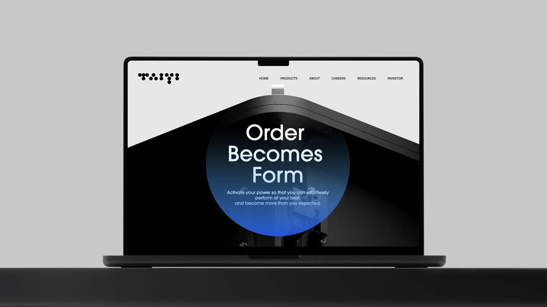
The hard-tech sector is going through an unprecedented wave of "branding." Quantum computing company Taiyi Liang Sheng completed its full brand visual system within six months of founding; BCI startup Geshita kicked off brand design right after closing a ¥570 million angel round. Hard-tech branding runs into a natural design problem: its core technology—the superposition of qubits, the neural signals of a brain-computer interface, the plasma confinement of fusion—has no intuitive counterpart in the macroscopic world. You can't photograph a qubit the way you photograph a phone and expect a user to instantly grasp "what quantum computing is."This invisibility of technology is precisely why hard-tech branding can't borrow the playbook of consumer brands. It demands an entirely new design paradigm.
Proposition 1: The Visual Translation of Abstract Technology
The first threshold of hard-tech branding is turning an abstract technical concept into a perceivable symbol. This isn't a question of "does it look good"—it's "can it be understood."
For quantum computing branding, the core challenge is that the "qubit" has no direct visual equivalent. Taiyi Liang Sheng's answer: use dots to stand in for qubits—deconstructing the brand mark entirely into uniform solid dots, arranged in a dot-matrix pattern that mimics the strokes of Chinese characters. A dot is a qubit; the matrix arrangement quietly echoes the discrete, digitized nature of quantum computing. This "technical metaphor" lets a viewer establish "this is a technology brand connected to quantum" the moment they see the logo.
Brain-computer interface branding faces a different challenge: it must not only be understood, but not misunderstood. Geshita's brand chose a "sound + brain" dual-anchor strategy—the inner space of the letter "g" subtly suggests brain-region structure, while elements drawn from sound-wave diffusion and MRI imagery are woven into the visual language. L3branding proposed a direction of "curvilinear expression for hard tech," using breathing, flowing lines to convey the link between life science and an emerging technology species—without letting the BCI brand feel "too cold" or "too sci-fi."
The translation path for fusion branding differs again. CFS (Commonwealth Fusion Systems) built its logo from 18 D-shaped geometric blades arranged in a ring, a direct replica of the 18 high-temperature superconducting magnets inside a tokamak—the ring simultaneously evoking a star and the endless cycle of fusion energy. It's an extreme application of the "structural mapping" path: the logo itself is a visual schematic of the underlying physics. Helion Energy, by contrast, adopted "plasma magenta" as its primary color, reproducing the true hue of billion-degree fusion plasma—a "literal analogy" route.
Proposition 2: The Balance Spectrum Between Professionalism and Approachability
Hard-tech brands must address three audiences at once: core technology developers, B2B industry clients, and the general public. Each expects something different—researchers value technical precision, clients value credibility, and the public values comprehensibility. Brand design must find a spectrum of balancebetween "professionalism" and "approachability," rather than a blunt either/or.
Color strategy is where this shows up most directly. Many hard-tech brands default to "tech blue," but the 2026 trend is splitting: CFS chose a warm terracotta as its primary color, using warmth to soften the coldness of hard science and communicate a clean-energy, broadly beneficial vision; Taiyi Liang Sheng layers a gradient-blue circle over a black-and-white base as its accent, lending the brand a "poetry of technology" through a soft blue gradient; Geshita pairs a black silhouette with ultrasonic flow curves, rendered with a lenticular printing effect for dynamism.
The key to the balance spectrum: don't go to extremes on the dimension your audience cares about most. For hard-tech, the safest strategy is "rational base + temperature injection"—keep professional restraint in the core visual elements (mark, primary palette) and add warmth in auxiliary graphics, applications, and extensions. That way researchers don't find it flashy, and the public doesn't find it cold.
Proposition 3: Full-Scene Adaptability and Ecosystem Synergy
One of the sharpest differences between hard-tech and consumer brands is the sheer range of touchpoints: the same brand mark may appear on a lab instrument's metal panel, a conference exhibition board, a fundraising deck's cover, a co-launch announcement with partners, and a social media avatar.
That cross-scene span makes enormous demands on a brand system's coherence.
Layer two: digital and industrial integration. Helion Energy runs a "static + dynamic" dual system—static covering office materials, fusion-device paint schemes, and international exhibitions; dynamic covering web interactions, short-video, and roadshow screens. This dual-track design is becoming the standard configuration for hard-tech brands.
Layer three: compatibility in ecosystem collaboration. Hard-tech is moving from "going it alone" to "ecosystem synergy"—CFS supplies high-temperature superconducting magnet technology to both Type One Energy and Realta Fusion; Taiyi Liang Sheng jointly develops quantum-AI models with Qingxing Yigou. In these multi-brand collaboration scenarios, brand design needs an "open visual framework": distinct on its own, never overshadowing partners in a joint launch.
Since 2026, hard-tech has been shifting from a "validation era" to an "industrialization acceleration era." In that shift, brand design is moving from "optional" to "essential"—not because it looks good, but because the brand is the infrastructure that converts technical value into market perception.Visual translation of abstract technology, a balance spectrum between professionalism and approachability, full-scene adaptability and ecosystem synergy—these three propositions constitute the "new infrastructure" of hard-tech branding.
Every hard-tech company scaling toward industrialization will need to answer them in its own way. The question brand design ultimately answers is: how do you make "invisible technology" visible, credible, and memorable? The answer determines whether a frontier technology becomes a force in the market—or stays a lab curiosity.
About Hauns
Hauns is a creative strategic thinking to import brand growth of the consulting company, we have a broad international perspective, to import brand within the creative strategic thinking, through the research analysis, strategic positioning, brand design and other professional core ability, build a complete brand system from inside to outside, with professional services for the brand, Help enterprises to achieve real brand growth, brand recognition image of a new look!

